Craigslist User Experience Redesign
For this project we took a look at craigslist, did user research to find the issues and redesigned it to be more user friendly. We found that the biggest issues were in how it was structured and its old dated design


We surveyed 8 users and found that our users were younger and more tech literate. Craigslist older format did not lend itself well to our personas, one of which likes the newest tech and the other who likes a pleasing aesthetic.
From our heuristic evaluation, we found that the biggest issues were the outdated look and clutter of the website. The information is overloading to the user and the site looks very old. Those were constant pain points that we found when going through the evaluation.

Our user testing backed up these ideas. Many users got confused and overwhelmed by the home page. They also commented on the page itself, saying it looked old. This clutter caused navigation issues and made the experience overall worse for the user.
“I feel like I’m on a site that’s made in the late 90’s and hasn’t been updated since.”
For my wireframes, I decided to draw them out. I had many iterations of the front page due to the mass amount of information on them. I struggled with how I wanted to condense them while not forcing the user to jump through a bunch of pages to get to the same place. I ultimately decided to choose the option of a drop-down menu. This allowed me to be able to keep a lot of the information on one page while not throwing rows and rows of words at the user to overwhelm them.


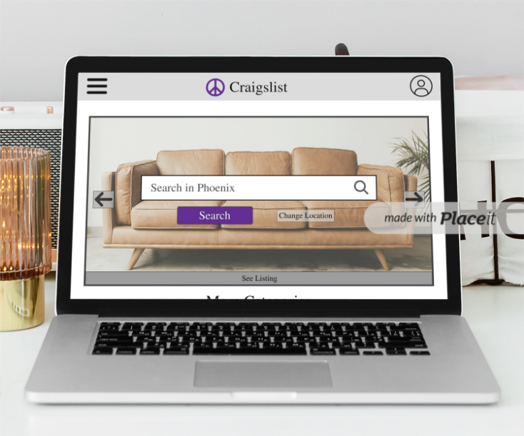
My final design took what I learned from the research and condense down the website to be much more modern and sleek. I got rid of the long list and instead added a big search bar(as that is what we found many of the users would go to first). It also shows current listing as a hero image in the background. I made sure to eliminate any scroll stoppers to ensure users would know more is under the fold. further down i showed off each category and what it would look like to open up one of the drop down menus. I also added a proper button for the event calendar to reduce clutter.
For the second page, I focused on making the grid more orderly and condensing the filter into one button that can be easily found compared to the icon that was used before. I also made the information simpler while also making sure that the user got the needed information.
If given more time, i would further flesh out the filtration system, as well redesigning the other categories. I would also spend time on the side bar menu.
The icons used on the project were found on the noun project, the couch image grabbed from unsplash, and the cars found from Craigslist.com

